Designers! Read this definitive guide on how to build apps for kids
Impatience. Stubbornness. Restlessness. Attributes like these make building apps for kids a formidable proposition. However, with a bit of insight, designers can design experiences and build apps for kids that can improve their brain development and help them play and learn.
“I definitely wouldn’t have gotten into programming if I hadn’t played games as a kid,” said Mark Zuckerberg.
Designers can have a significant influence over future generations because creating a winning app for kids has an incredible but often underestimated power to mold the future.
These winning apps may someday be responsible for creating the next Zuckerberg.
Building apps for kids isn’t easy. In fact, it’s often quite difficult. But the most popular interactive apps for kids have achieved success because they follow certain best practices.
We’ll look at:
- The differences between designing for kids and adults
- The similarities between designing for kids and adults
- A framework for designing apps for kids
- Tips and best practices for building apps for kids
Building apps for kids vs. adults: the 4 Key differences
The main difference between building apps for kids and designing for adults comes down to the goal(s) of the users. According to Debra Gelman, author of Designing for Kids: Digital Products for Playing and Learning, when designing for adults—even when developing games for adults—the goal is to help them cross the finish line. When designing digital products for children, the finish line is just a small part of the story.
Here are four key differences to consider when building apps for kids.
Kids love a good challenger or conflict
Using a banking or email app, an adult wants to accomplish their tasks as quickly and efficiently as possible. Whereas a child, playing a game, enjoys challenges and conflicts along the way because, in the end, it makes their accomplishment more significant.
A prime example is Toca House, a popular iPad app by the makers at Toca Boca, which challenges children to vacuum a dirty rug. Of course, the rug is not clean after just one swipe because that wouldn’t be hard enough.
Gelman says that micro-conflicts (like vacuuming a dirty rug) help children resolve their own inner conflicts. She bolsters her case with a LEGO study on conflict play, which states that micro-conflicts help kids develop skills such as:
- Predicting how others are likely to react to their behavior
- Controlling their own emotions
- Communicating clearly
- Seeing other people’s points of view
- Creatively resolving disagreements
Kids want feedback on everything
When playing in a digital space, kids expect visual and auditory feedback whenever they interact with something. Most successful children’s apps generate a response (feedback) to every interaction. Children expect to be rewarded for whatever they do.
Kids are more trusting than adults
Because children can’t predict or understand the consequences of their actions ahead of time, they are typically much more trusting than adults. Designers need to build safeguards into children’s apps.
Kids develop faster than adults
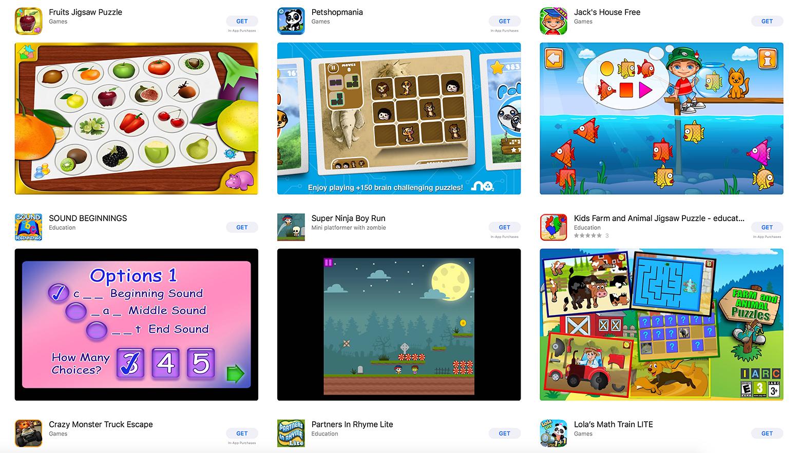
In the Google Play Store and Apple’s App Store, the kids’ category can be filtered by age ranges: “Ages five and under,” “Ages 6-8,” and “Ages 9-11.” Kids develop much faster than adults: an app for a four-year-old won’t be a fit for a six-year-old.
A good rule of thumb is to focus on a two-year age range. There are differences to consider between a four- and an eight-year-old. While one age group may dive in and learn the app as they go, another may need clear instructions to boost their confidence in using the app.
Designing apps for kids vs. adults: the 4 key similarities
The good news is, there are still quite a few similarities between designing for kids and designing for adults. To build a children’s app, designers simply need to keep in mind everything they already know about good UX design.
Here are the four key similarities of designing apps for kids and designing for adults.
People expect consistency
Children and adults both expect consistent design patterns. Contrary to popular belief, kids don’t like it when everything on their screens does something “cool.”
According to Gelman, both kids and adults get annoyed by design elements that seem random and unnecessary. Children like items on a screen to do cool stuff as long as there is a method to the proverbial madness.
Elements that get in the way or animate spontaneously or don’t contribute to the overall goal can frustrate kids and adults alike, and cause them to abandon a game or an app. Debra Gelman.
People need a reason to use an app
Whether designing for kids or adults, designers need to clearly articulate what an app does and how it works, or risk people becoming bored with it very quickly.
For both adults and children, an app must have a purpose, and its purpose must be obvious from the start. While it’s easy to believe children will love exploring an app, they’ll quickly become bored if it doesn’t give them a good reason to keep using it.
People don’t want to be shocked
People count on an app working a certain way, and they expect it to do so. For example, when an adult buys something online, after they pay, they expect an email confirmation as well as a message that confirms the purchase. People don’t want to be re-routed to a landing page that tries to upsell them on another offer.
Gelman says the same is true for kids and provides the following example:
“As a kid adding gems to a box in a game, they expect to be able to open the box where the gems are stored to see them all, not to have to open the box, pull out drawers, and hunt for the stuff they thought was in there.”
People enjoy a little something extra
Gelman calls this a lagniappe. A lagniappe is a little something extra—an Easter egg—thrown in to delight people. Both adults and kids enjoy these small, unexpected interactions that enhance their experience with an app.
For example, Snapchat’s “pull down to refresh” feature shows a dancing ghost that changes colors, letting people know their feed is updating with a touch of playfulness and delight. Lagniappes are different from shocks, which people don’t enjoy.
A framework for designing successful apps for kids
Designing a great children’s app is more than just dumbing down adult concepts. As with designing for adults, designers must understand their users and the context of use: their cognitive, physical, and emotional situation, so the app will resonate with them.
It’s best not to stray too far from common mobile app design principles, which is why it’s helpful to understand the similarities of designing for kids and for adults.

Drop the sketchbook and pick up the notebook
Designing a successful kid’s app is hard because designers are not children. Designers must be able to empathize with the people they’re designing for, and kids can be difficult to understand, especially for those who don’t spend much time around them.
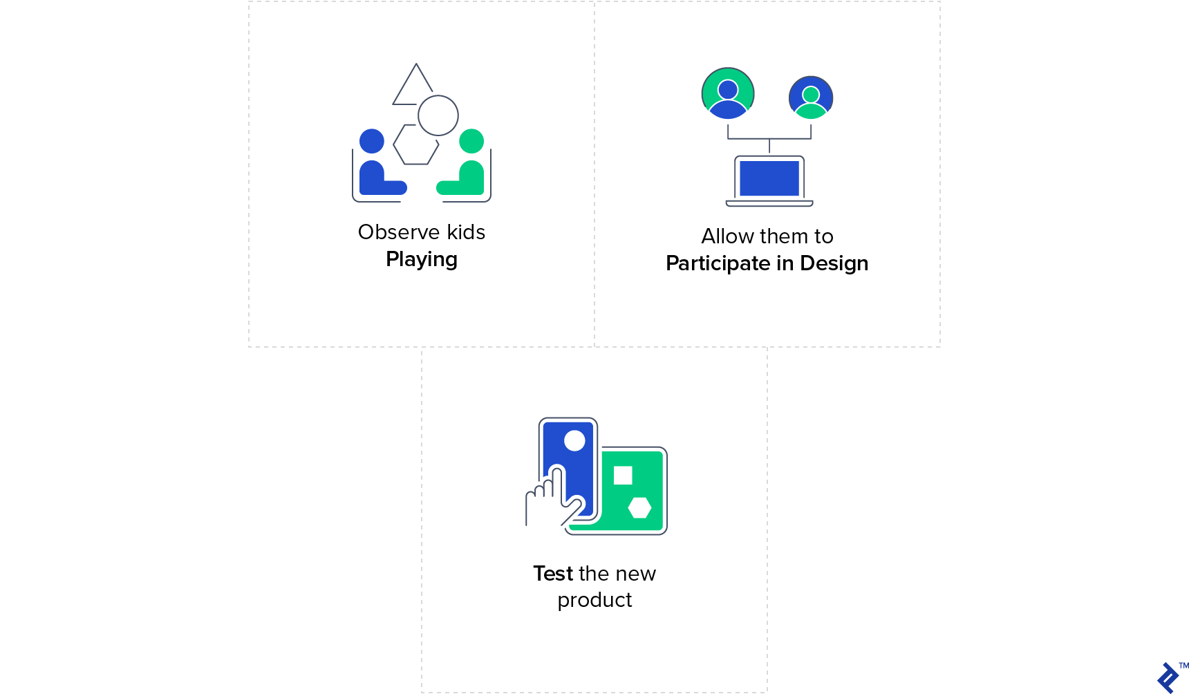
Instead of observing kids at random, it’s best for designers to choose an age range—not more than two years between them—and note how they interact with each other, what holds their attention and what doesn’t. It would be best to observe groups of girls and boys who know each other at least slightly.
Children communicate volumes simply by how they play, what they choose to play with, how long they choose to play with it, and when they decide to play with something else. Debra Gelman.
When observing, designers need to pay attention to how children play, communicate, and interact with objects in their environments. Surprisingly, any silly thing a child does could potentially tell designers how children may use their app.
Some things to look for:
- Do kids in this age range enjoy sticking to the rules, or do they prefer inventing their own games?
- Are they trying very hard, or are they just trying to out-silly each other?
- Are there differences between the ways boys and girls approach play?
After observation, designers need to choose a specific type of play to narrow in on how that relates to designing the app for kids. Toca Tea Party, the popular iPad app by Toca Boca, is a prime example. It began as a paper prototype, with cutouts of teapots, cups, and saucers, sitting on top of an iPad. The creators set out the elements and let the children play with it.
“Originally the idea was to make the food, but the kids just wanted to get past that part,” says Jeffery. “Now we have premade cakes but you get to set the table. One of the most appreciated features was spilling. That came from the kids. ‘Ooooh, he spilled!’”
Consider participatory design when designing for children
Participatory design, also called co-design, is an excellent method for understanding children. It involves gathering groups of children, giving them craft supplies, and having them come up with their own design ideas.
Doing so helps designers—not because the kids’ designs will be good—but because designers will understand the kids’ different perspectives. If a girl creates a fairy to help her with her homework, what type of personality does it have? Is she mischievous like Tinkerbell or caring like The Fairy Godmother in Cinderella?
User test the children’s app design
For obvious reasons, app designers would need to test the app with children using a prototyping tool that allows testing of complex interactive tasks with gestures, such as swiping and zooming.
Testing gestural interactions are essential because younger children haven’t yet developed their motor skills in the way that adults have, and aren’t able to use their hands the same way adults can. One children’s app designer recommends staying away from these types of gestural interactions altogether and sticking to the classic arrow buttons.
The prototype can be given to a child, and they can be asked to teach others how to use the app, and be observed while teaching another child how to use it.
Tips and tricks for app development for kids
Designing for kids is a radically different ballgame than designing for adults. They love bright colors, and they want feedback on everything they do. To take things to the next level, a variety of experts offer their best tips and tricks for designing for kids.
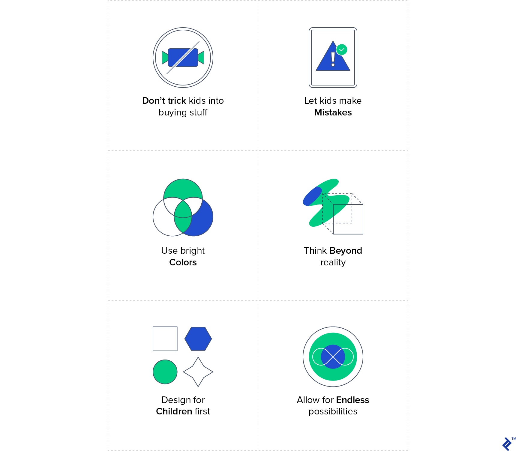
Let kids make mistakes
Word Wizard is an app that teaches kids how to spell with a moveable alphabet that embraces mistakes. Kids can put letters in any order they like, then the app reads the “word” aloud, allowing children to understand how the letters sound together.
For example, a child might put together a 100-character “word” or a fascinating amalgamation of seemingly nonsensical sounds. They can change the playback speed, accent, and tone, which adds to the playfulness and immersive power of the experience.
There’s no abrasive buzzer alerting kids they created a word that isn’t in the dictionary, and there is no red “X” icon placed beside the imaginative juxtaposition.
Kids will understand that they made a mistake on their own by listening to the result. “Mistakes are ok. It’s ok to make mistakes,” Pierre Abel, the creator, said. “Mistakes are a natural part of learning. Integrate the mistake into the learning.”
When asked what advice he’d offer designers interested in building children’s apps, Abel says it’s vital that education apps are built on facts. Otherwise, they’re useless.
“There are a lot of apps out there where the person didn’t do their homework. You can easily get a book on a new topic, and learn everything you need to know before you start developing the app. If I ever have a doubt, I ask experts and they explain everything to me.”
Give children endless possibilities
Josh Sheldon, Director of Programs at MIT App Inventor, says the best children’s apps give kids the freedom to explore and delve into an immersive experience.
“Make sure it isn’t entirely scripted,” he recommended. “Give kids the ability to take their own path or journey through a new experience.”
Design for children first
Designers can miss the mark when they try to design apps aimed at children from an adult perspective.
“This can vary from having interactions that seem ‘normal’ from an adult point of view, such as tapping an object to select it and then tapping again to use it which is not something that kids can relate to. Kids tend to pick up an object, and make their action straight away, it’s not a two-step process for them,” Victor Guerrero, the programmer at Toca Boca, said.
Guerrero cites Vectorpark as a good example. “Vectorpark is very good at interactivity and the physicality of interactions. Playing around with objects feels super-nice. The concepts are always surprising which fires up the kids’ (and adults’) imagination.”
Kids are more imaginative and physical than adults. Designers need to “try to surprise them, and create systems that give them freedom so they can explore, and be creative within the app,” Guerrero said.
Keep adults in mind as well
Pierre Abel reminds designers that the app must also please parents because it’s not the kids who are buying it, which can make things a bit challenging. To circumvent this obstacle, Hopscotch, an app that teaches people how to code, gathers as much feedback as possible from a wide variety of people in different contexts.
It’s highly recommended to get as much feedback as possible from kids, teachers, and parents in a variety of different contexts. When designers build apps for kids, the app will be less likely to have biases if app designers actively seek out the opinions of diverse groups of people.
Think beyond reality
Limiting available interactions because they don’t fit into “reality” could prove to be an unfortunate practice when building apps for kids. For example, making some clothes only available to certain characters, or not being able to do things just because you can’t do it in reality.
“One feature in Toca Boca apps that kids love is being able to stack many items on top of each other, such as hats or scoops of ice cream. It’s hard to do that in real life but kids don’t care about that, they just want to play and have fun,” he said. “Challenging the norms can often give an interesting perspective on play, and usually challenging norms is fun too.”

Kids love “hard fun”
A first-grader inspired the late mathematician, learning theorist, and visionary for technology-based education Seymour Papert to find the term that had been eluding him: “hard fun.”
“The Gardner Academy was one of the first schools to own enough computers for students to spend significant time with them every day. Their introduction, for all grades, was learning to program in the computer language Logo at an appropriate level,” Papert wrote. “A teacher heard one child using these words to describe the computer work: ‘It’s fun. It’s hard. It’s Logo.’ I have no doubt that this kid called the work fun because it was hard rather than in spite of being hard.”
Hard fun boils down to the belief that everyone enjoys themselves when they are working on something challenging. Combine learning and fun, and you’ll have an app kids can’t help but stick to.
Papert wouldn’t recommend that designers take a play from curriculum designers’ playbooks, but instead look to game designers and developers for guidance.
Don’t trick kids into buying stuff
Pierre Abel recommends keeping ads out of children’s apps because they just aren’t prepared to handle it. A dad agrees and shamelessly called out the kids’ app Talking Tom Cat 2 on Smashing Magazine.
“A lot of apps do this, but Talking Tom Cat is the absolute worst. The screen is a landmine of carefully placed icons that lead to accidental purchases, not to mention the random animated banner ads that are designed to draw attention away from the app itself,” he wrote. “GoDaddy’s dark patterns that try to trick users into buying more domains are one thing, but if you try to use persuasive design on my young daughter, all bets are off. Your app will be deleted, and we’ll never do business again.”
The children are out future. Let’s design apps that help them lead the way
Today’s youngest app users, the freshly minted Generation Alpha (born post-2010), have unprecedented exposure to digital technology. Recent studies have found that in the US, 75 percent of children younger than eight have access to a smartphone or tablet, as do 36 percent of kids under the age of one.
While this means building apps for kids can reap massive monetary rewards, it also—and arguably most importantly—means that app creators have the potential to influence an entire generation. It’s a big responsibility, and designers ought to tread carefully.
TheToptal Design Blog is a hub for advanced design studies by professional designers in the Toptal network on all facets of digital design, ranging from detailed design tutorials to in-depth coverage of new design trends, tools, and techniques. You can read the original piece written by Tanya Junellhere. Follow the Toptal Design Blog on Twitter, Dribbble, Behance, LinkedIn, Facebook, andInstagram.
Celebrate Pride 2020 with us this month!
Why is queer representation so important? What's it like being trans in tech? How do I participate virtually? You can find all our Pride 2020 coverage here.
