5 reasons to go vertical for your next video or presentation, and how to do it right
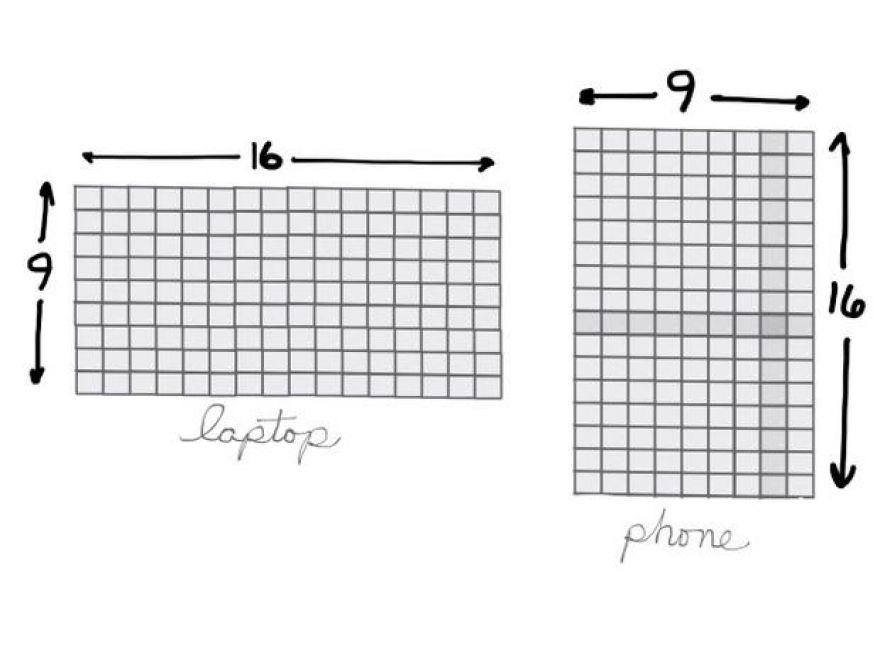
Most presentations I've seen look the same: Slides displayed inside a horizontal frame. On an HD display, presentations look wide, with 16 horizontal units for every nine vertical units. With an older projector, the screen looks closer to square, like an iPad held in landscape mode. (That's a 4:3 aspect ratio, four horizontal units for every three vertical units.)
But, when you attend a meeting or conference, what device do you carry? Most likely your phone.
I think it's time to experiment with vertical presentation and video.
To be clear, I don't mean to suggest that all presentations and video should be vertical.
I think the following five factors will lead to an increased number of videos and slides viewed vertically.
1. Most people hold phones vertically
Pick up your phone. Your hand grasps the phone in portrait mode, right? That's a vertical screen, often with a 9:16 ratio (think of an iPhone 6s Plus).
Could you turn your phone to view a video? Sure. But, according to Josh Clark in "How We Hold Our Gadgets," observation shows that people tend to hold a phone with a vertical orientation. The study he cites indicates that only about 10% of people held phones in landscape orientation. What's possible and what most people actually do are different things.
2. Most younger people watch video on phones
About 75% of people between 18 and 29 years old watch video on their smartphone, according to a Pew Research Center report from March 2015. Older people watch much less: Only about 31% of people 50 or over watch video on a phone.
3. We view vertical screens more than ever before
We spend six times as much time with vertical screens today than we did just five years ago, according to Mary Meeker's 2015 Internet Trends Report. That's not a surprise, really. That correlates with the massive adoption of smartphones.
4. Some popular apps prefer vertical video
Mary Meeker also cites the Snapchat stat of "9x higher completion rate" for vertical video ads than horizontal ads. Vertical video ads on Snapchat perform better than horizontal ads.
Other apps show a preference for vertical video, too. The New York Times cites the example of Lowe's, which uses Vine six-second videos, which are square and display in vertical orientation, to share do-it-yourself project tips. The Periscope live-streaming app now supports orientation changes, but began as portrait-only.
5. Video sites properly play vertical video
Google redesigned the YouTube mobile apps to support "full-screen vertical videos" in July 2015. You'll no longer see black bands on both sides of your video. Instead, vertical videos on YouTube fill your phone's screen.
Vimeo supports full-screen vertical video playback, too. FiftyThree, the creators of the iOS app, Paper, built the app to work in portrait orientation on an iPhone. FiftyThree shared a blog post—with a vertical video on Vimeo—that shows both the design process and app features.
How To Create Vertical Video
To shoot vertical video, hold your phone upright, open the camera app and switch to video mode. Record your video. Fairly straightforward. (Want more detailed advice? Take a look at Chistoph A. Geisler's post that shares what he learned when he made a vertical video documentary.)
One thing to note: Some apps, like the YouTube Capture app, by default won't record video with the phone held vertically. They're strongly biased toward horizontal video. There's a fix, though. Simply turn off "landscape lock" in the settings.
How to Create Vertical Slides
Google Slides supports vertical slides. First, tweak the page setting for your Google Slides from the web view. With a new Google Slide file open, choose File > Page Setup, then choose Custom from the drop down menu. Change the units to Points, then enter 1080 x 1920. With this size, your slides will perfectly fit both the Nexus 5x and iPhone 6S Plus. (Microsoft PowerPoint supports portrait slides, too.)
When you add content to your slides, you might borrow a design cue from FiftyThree's Paper app for the iPhone. Paper displays an image at the top, with text notes below. People are visual—they'll respond first to images, secondarily to text. Slides should emphasize images, not text, especially when made to be viewed on a phone.
Go ahead and get vertical. Vertical orientation works well for any subject with more height than width: Things like a waterfall, a skyscraper, Michelangelo's David, or any professional basketball player. Or, in a professional setting, vertical orientation can capture a close-up of a person speaking, a mobile app in action, or an easy-to-show but hard-to-describe task.
Horizontal, widescreen video and slides won't disappear. But, as the phone becomes the most-commonly used device, I expect we'll see more experimentation with vertical video and slides.
Your take?
Have you created slides or video intended to be viewed on a phone held vertically? Share examples in the comments.
Click here to automatically subscribe to our Mobile Revolution newsletter.
Also see
- Google Slides on your phone: Insert images (TechRepublic)
- Use your smartphone for slideshow presentations (TechRepublic)
- Quick Tip: Update your slides to the new default 16x9 standard (TechRepublic)
- With Microsoft Sway, your next presentation doesn't have to suck (TechRepublic)

